Avoid a choppy feel in your interior by choosing a flow-through color, paying attention to sightlines, working with accessories and more.
Color preferences vary as much as personalities, with some folks loving the bright and the bold, while others feeling most secure surrounded by neutrals. The good news is that when it comes to color, there really is no “correct” palette.
That said, we’ve all been inside homes where an explosion of color created a choppy feel between rooms — and sometimes, the urge to run. We asked five color, paint and design experts to share their best tips for creating a cohesive flow of color throughout your home. The strategies vary, but any of them can help you come up with a holistic decor scheme for your entire residence. So choose the ones that work best for you.
Pick a Flow-Through Paint
One simple way to create a cohesive feel is to use a consistent paint color on the walls of connecting spaces. “Particularly in homes that have more of an open floor plan, it’s best to choose one color that is going to serve as your main color or your neutral,” says Kelly Porter, an interior designer based in Washington, D.C. “That doesn’t mean it has to be beige or white or gray. But the foyer, the hallways and that main connector room should all be the same color because you want that to have dominant color in your space.”
Pay Attention to Sightlines
San Francisco interior designer and color expert Jennifer Ott frequently works with clients who want more variety in their wall colors. When that is the case, she suggests considering sightlines. When you’re standing in the living room, what other rooms will you see? If you have a view into the kitchen, the dining room and the foyer, then the colors for those spaces need to work well together. “It can start to look really wacky if you have a different color scheme in each room,” Ott says.
Choose Color Groups
One way to increase the likelihood that a color scheme flows from room to room is to limit yourself to colors in the same temperature family. “Some people will stick to a warm color palette — reds and oranges and yellows — or a cool scheme — grays and greens and blues,” Ott says.
Another option, Ott says, is to select one or two colors and then use variations of it. If the main color is blue, you might select a gray-blue, a pure blue and a navy paint as you move from room to room. The same concept can be used for decorative accessories.
For wall paint, you can ask the paint store to create a “tint” of a particular color, perhaps knocking down the main color by 50 percent, which the mixer will do by adding white. “They can create a lighter or darker version of it,” Ott says. “That’s a good way to unite without putting the same color everywhere.”
“I also tell people if they’re going to do their wall in this color, go two or three shades lighter for your ceiling so it doesn’t look like a sore thumb because you painted it white,” says Keith Wardlaw of Plus Modern Design in Kansas City, Missouri.
Paint decks can also be a good inspiration source for finding colors that work well together.
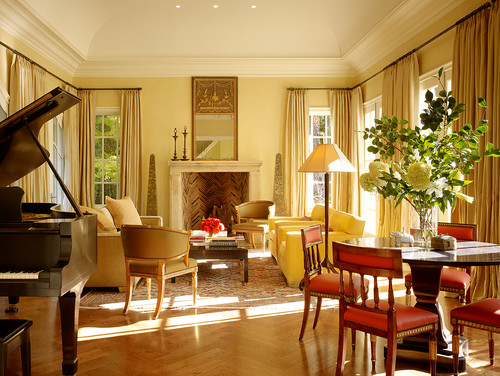
For Bold Colors, Use Accessories
Accessories are a less expensive way to introduce dramatic colors than purchasing a couch or rug in the same tone, and they’re also easier to swap out should you tire of a color. Limiting bold colors to accessories also helps you avoid the shocking effect that can happen when a dramatic shade is painted on all four walls. “The key is finding a way to inject the color that makes rooms interesting and exciting without feeling like you need to escape,” Ott says. Bright color is good when you want to highlight a piece worthy of notice.
Tie Rooms Together With Accents
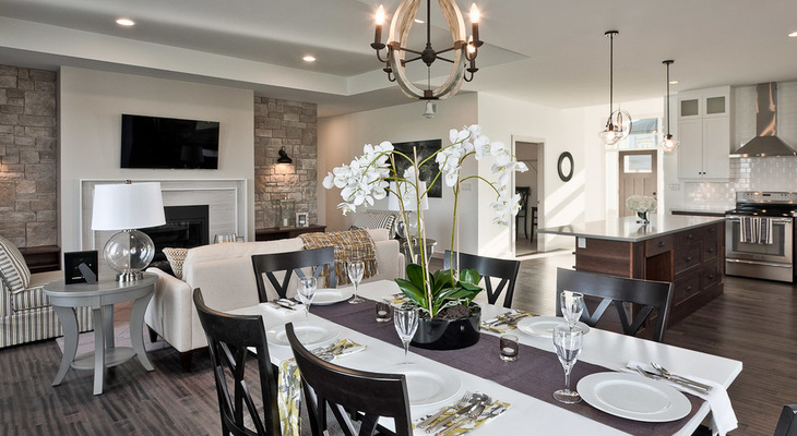
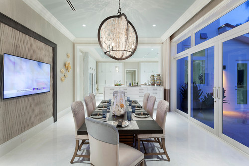
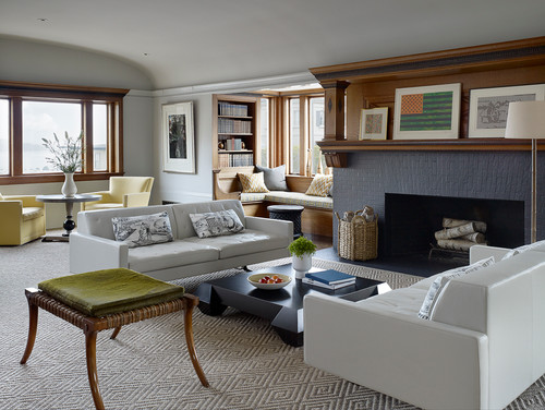
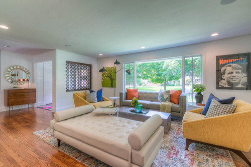
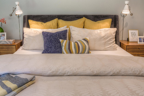
Accents colors can change from room to room, but continuing one consistent color throughout the home can help create a sense of continuity. “Let’s say you have green and blue in your living room,” Porter says. “Perhaps for the dining room, you use one of those two colors, maybe just the blue. Or you could do blue and yellow. So the blue is what will tie those rooms together.” The two rooms pictured are from the same home and illustrate this principle.
Use the 60-30-10 Formula
Another way to create a cohesive flow from room to room is to think of the palette for your home as a math problem. “Use a base color that you really like as 60 to 70 percent of what you’re going to paint for your interior,” Wardlaw says. “Your next color needs to be 25 to 30 percent. Then you can do your accents of 5 to 10 percent.”
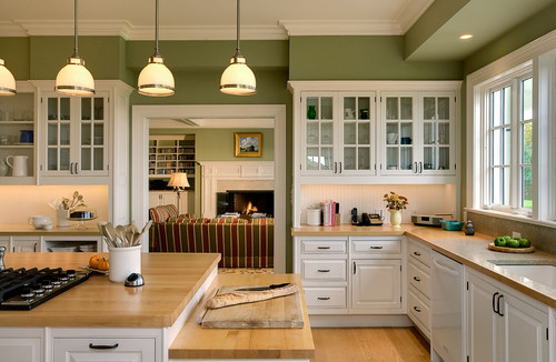
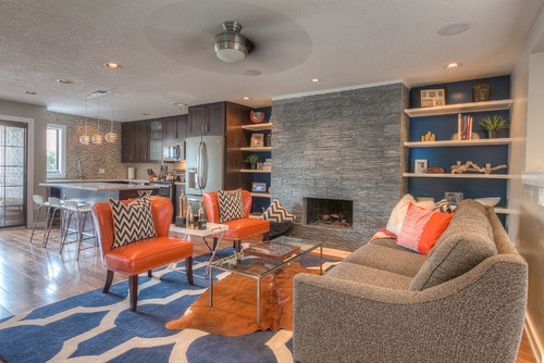
In this photo, which shows one of Wardlaw’s designs, gray is the 60 percent color, blue the 25 percent, orange about 10 percent and brown maybe another 5 percent. “I really try to make people only go with about three colors, four at the max — at least on the interior,” Wardlaw says. “Otherwise it just feels chaotic.”
To pull the colors throughout the home, you might use a variation on the scheme in an adjacent dining room. The walls might be painted blue, and perhaps gray could be used as an accent, with a few small orange accessories providing the 10 percent dose of color. “As long as you keep it cohesive throughout your entire home, it’s going to make more sense,” Wardlaw says.
Consider Using Color-Planning Tools
Those who love delving deeper into design principles may want to read up a bit on color theory — or at least ask your interior designer about it. “One of the main things I explain to my client is the color wheel,” Wardlaw says. “To keep that cohesive feel throughout your home, one of the main things you can do is consult that.”
You can read up on the color wheel to understand how colors work with and against one another. But a basic rule of thumb is that using analogous (or adjacent) colors on the wheel will create less contrast and a more calm feel, while choosing complementary colors (across from one another on the wheel) will create greater contrast and a higher-energy room. Understanding the relationships between colors will help you see why certain combinations have certain effects on you.
You might also consider making a mood board for each of the rooms to get a sense of how they’ll flow together. You can print out photos of your furniture along with the paint and accessories you are considering, then lay them out on paper, room by room. You can sketch out a rough drawing with colored pencils. And you can preview furniture in your own spaces electronically with Houzz’s Sketch app.

When Unsure, Hire an Expert
Designers have studied color and get paid to advise people on their choices. When you need guidance, they can help.
Porter, who does a lot of color consultations, says her clients tend to know what color they want to use in terms of color, but need validation that the shade they are considering will produce the desired effect. Recently, the designer did a long-distance consultation with a client who passionately loves orange. “The colors she was telling me about were very bright and childlike,” Porter says. The designer suggested a more adult rusty orange instead. “She tried it and loved it,” Porter says.
Tell us: Have you achieved a great color flow in your house? What tricks did you use?
Related Links:
Refresh Your Home With the Help of a Painter
How to Create Calm With Light Colors
Add More Color With a New Rug