A down-and-out kitchen catches the joy wave and turns up the fun for a social family of 5.
These homeowners aren’t fans of bland. After moving from the Midwest to embrace the laid-back vibe of the West Coast, the frequent entertainers wanted to bring spunk to their neutral kitchen. Now new white cabinets and counters keep the room light, while vibrant yellow window trim, funky hardware and custom tile in retro colors jazz it up.
Kitchen at a Glance
Who lives here: An active family of five, including three boys ages 9 to 15
Location: Marin County, California
Size: 300 square feet (27.9 square meters)
Year home was built: 1959
Designers: Ann Lowengart Interiors and Henry Taylor Architect
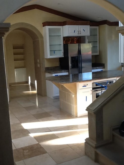
BEFORE: The original kitchen needed a serious upgrade, and the homeowners sought a complete departure from its heavy, mismatched look.
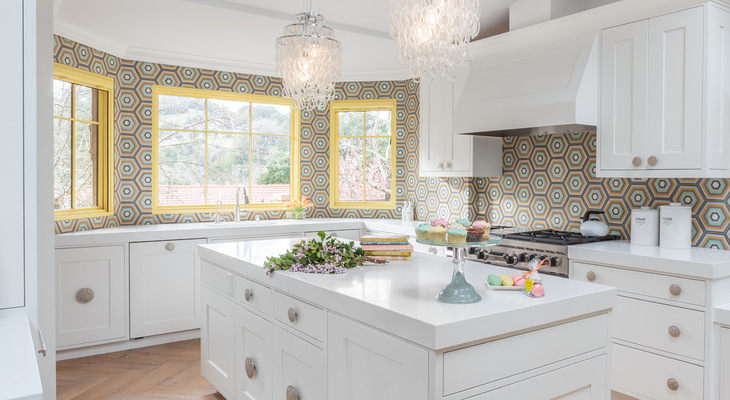
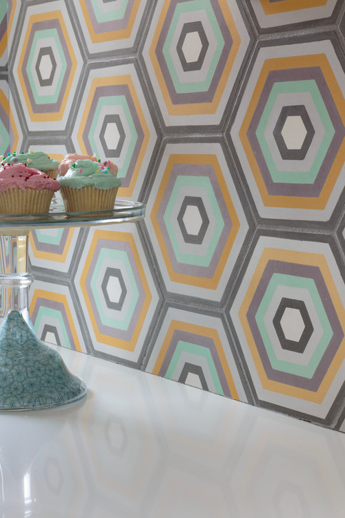
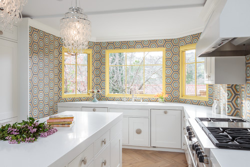
AFTER: Interior designer Ann Lowengart says the new kitchen needed to be “all about vibrancy and color because that’s who they are as people.” The crown jewel is the mesmerizing custom-made cement tile backsplash, a sherbet-y mix of gray, orange, lavender and mint green.
Because the game plan was to gut the old kitchen and begin with a clean slate, there was opportunity to integrate the homeowners’ impressive list of requirements: two refrigerators, an ample pantry (located on an opposite wall, not pictured), an island, a large-capacity 48-inch Viking range and two dishwashers.
Quartz countertops in a dappled white pattern support the pristine look and, with an undermount sink, are easy to clean. The dishwashers flank the sink and are clad in a wood overlay to match the cabinetry.
The custom cabinetry has Shaker-style bones, but Lowengart “blew up the design” by playing with the scale. She then injected some 1960s funk by installing oversize textured knobs in the center of some of the cabinet doors instead of the stile. Painting the window trim a zippy yellow also bolsters the fun vibe.
Two chandeliers of interlocking glass hang over the island. The floor was the project’s biggest splurge. Made of cerused oak, the herringbone pattern required a lot of labor and time to install. Cerused oak, which is treated with a light whitewash, has a classic old-world tone that provides a hint of traditional balance to the finishes. Diagonals of the herringbone pattern also pick up the slanting shapes of the hexagonal backsplash tiles.
Related Links
Browse More Than a Million Kitchen Photos on Houzz
Revamp Your Kitchen With Trendy New Tile
Design Your Dream Space With the Help of a Local Pro
