Our ‘Design Dilemma’ series continues with advice from the pros. To recap, Micki blogs at Confessions of an ADD Housewife, and needed some ideas on how to update the kitchen in her well-loved historic home. From floor to ceiling, our designers covered every square inch with advice and recommendations! Check out our prior post with Micki’s before photos.
Andrea from Keeping It Cozy and Sara from Embrace My Space weighed in with advice for Micki.
Cabinet Upgrade
Sara: To give the kitchen a contemporary look, the pulls in the center of the cabinets should be replaced with a small knob. Drawer pulls could be replaced with knobs as well, or updated with new pulls that compliment the new cabinet knobs. I’d suggest painting the cabinets a bright white to contrast with the grey countertops. Refreshing the cabinets and drawers with a fresh coat of paint will certainly work wonders for upgrading this kitchen.
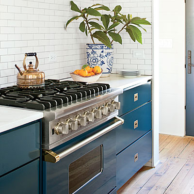
Andrea: Spruce up cabinets with new paint and hardware. Add inexpensive corbels underneath upper cabinets for a custom look. If you decide to paint, consider painting your cabinetry, especially lower cabinets, with a bold color.
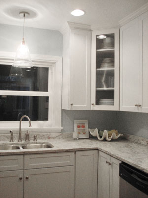
Young House Love Cabinet Hardware
Corbels from Love of Family and Home
Bold Cabinet Color from Southern Living
Flooring
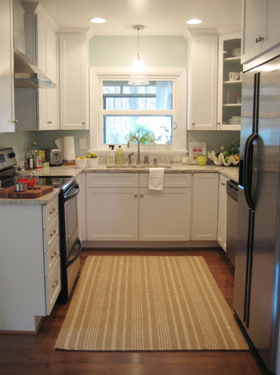
Young House Love Area Rug
Open Shelving and Storage
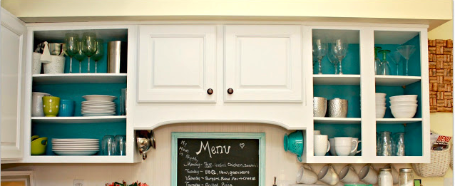
Open Shelving – Mom 4 Real
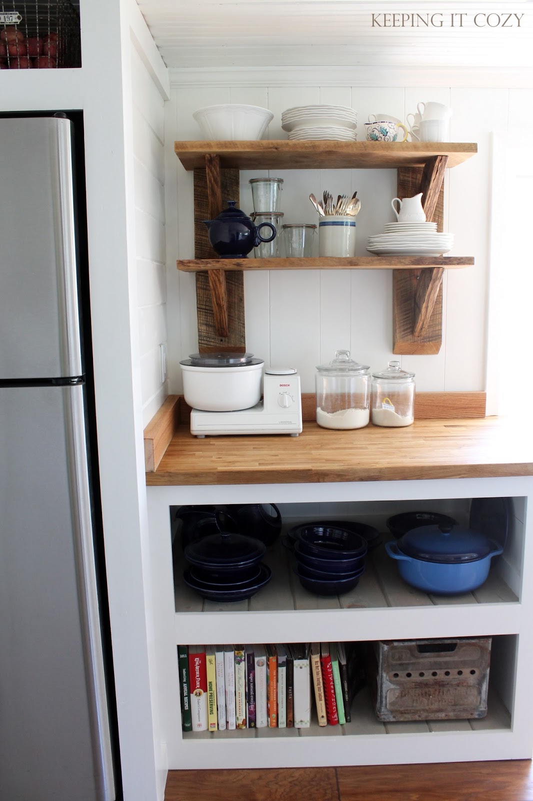
Open Shelving and Storage – Keeping It Cozy
Floorplan, Walls, and Ceiling
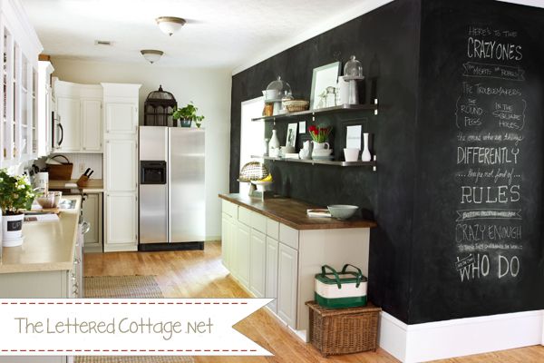
Chalkboard Wall – The Lettered Cottage
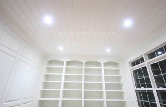
Plank Ceiling – Sawdust Girl
Backsplash
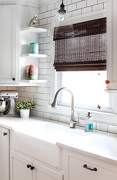
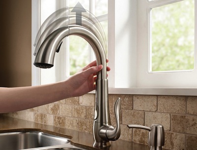
Updated Backsplash and Wheaton Faucet – 7th House on the Left
Color
The Designers

Andrea and her husband live in a tiny southern town with two precious daughters, ages 5 and 2. They love the simplicity of country living, so they sold their house in the city two years ago and bought an 80-year-old farmhouse full of character. A few of Andrea’s favorite hobbies include decorating and restoring her home, cooking, attempting to garden, learning how to sew, and dreaming up new projects.
You can follow Keeping It Cozy on Facebook and Pinterest.

Sara is a recovering lawyer addicted to spray paint, shelter magazines and the color turquoise. She started her blog, EmbraceMySpace, as a tribute to the home she had to sell when her family was relocated for her husband’s job. Now she’s tackling design and DIY projects at her new home; loving every success and learning from every failure along the way! Sara hopes that by sharing her design experiences she can help you to embrace your space. For more details on the story behind Embrace My Space, visit Sara at http://embracemyspace.com/about/.
You can follow Embrace My Space on Facebook, Twitter, and Pinterest.
Kitchen Contributor
Micki is a crafter, blogger, and DIYer. She has six children and is currently restoring her family’s 100+ year old American Foursquare (a craftsman without the cool built ins) with her husband on a cash budget. She also coupons, and is a contributing editor with LLL’s New Beginnings.
You can follow Micki’s blog, Confessions of an ADD Housewife on Facebook, Pinterest, and Twitter.
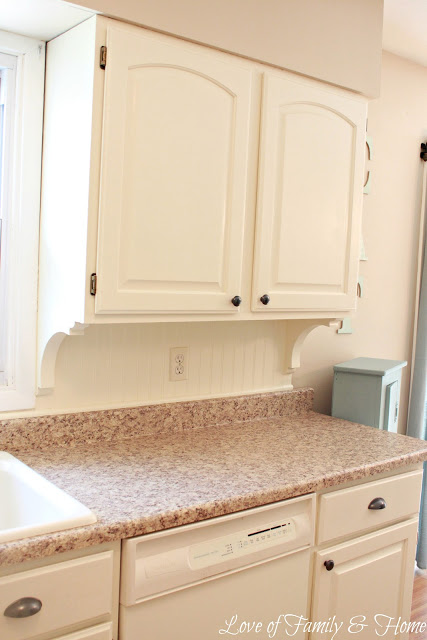

Live the idea of corbels…we can’t raise our cabinets, but they would add some flair
I love the chalkboard wall idea! It creates a surprisingly soft addition to the extremely crisp white room. I also like the clever use of the reclaimed wood shelving and adding a nice pop of color with it. Nifty!
Love the teal color in the kitchen!
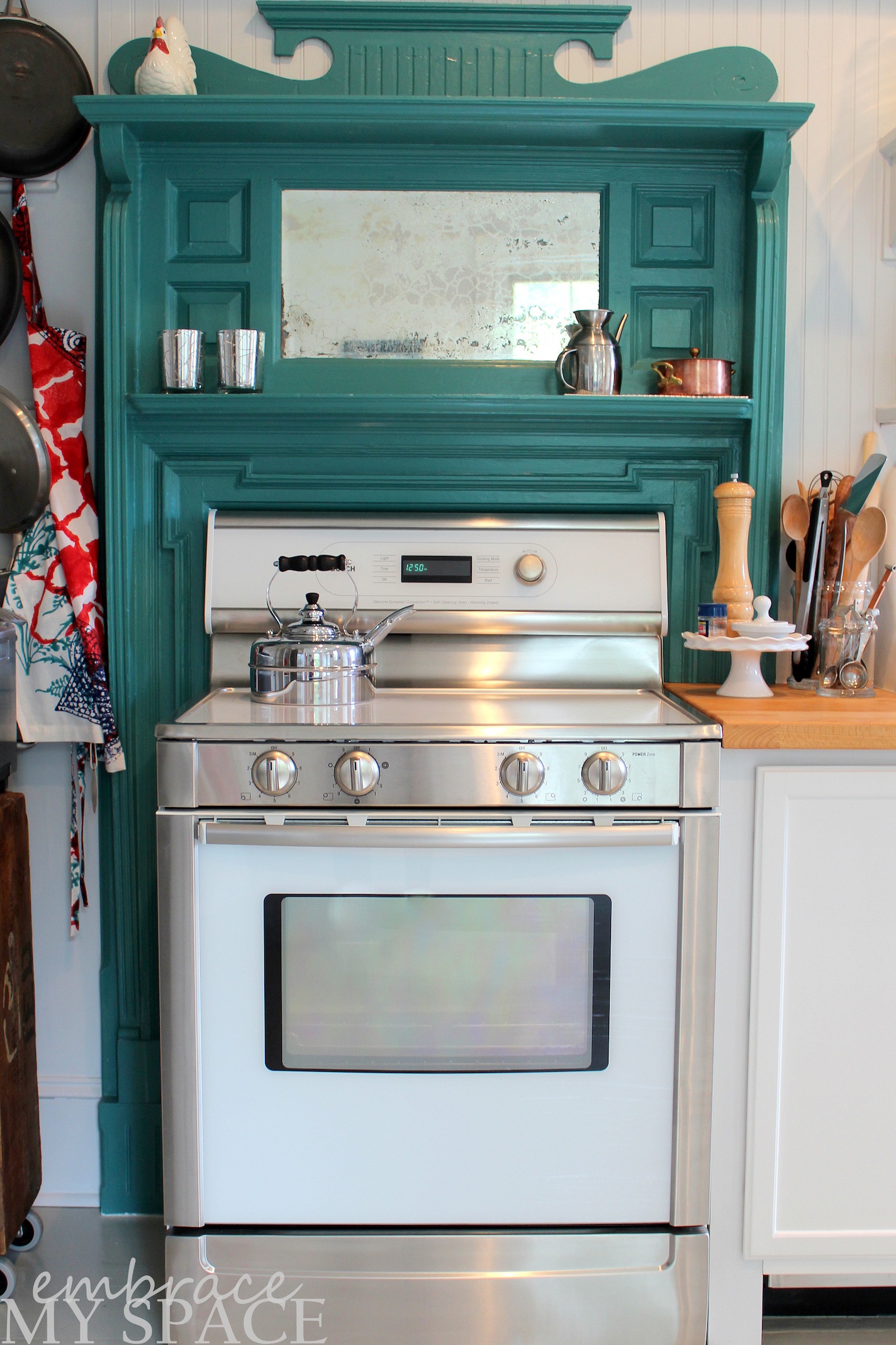
I adore the reuse of the mantle around the stove. Brilliant and clever!!
I love the pop of teal! So pretty!
I love the reclaimed wood shelving above the stove! The color pop is awesome!
Open shelves in kitchens are one thing I will always love – it broadens the space and feels so homey. And I really love that chalkboard wall!
I love the subway tile! Such clean lines, yet sophisticated!
I love the plank ceiling. I’d love to do that in my kitchen.
I didn’t know what a corbel was until I read this…and they look GREAT! Very fished look. I love the teal paint in the kitchen too.
Beautiful kitchen! Love the pops of teal.
We are in the planning stages of our kitchen remodel. Our current kitchen is TINY, so we will tear out a wall between the kitchen and den to make both these spaces a NEW kitchen…can’t wait! So much inspiration here, thanks for sharing!
Blessings,
Cindy
Love the bold color cabinets & the use of chalkboard paint for accent walls, lovely!
So many gorgeous kitchen ideas. I’m sure we’ll incorporate a few in our new kitchen. I’m commenting here for the giveaway. Jo @ Let’s Face the Music
I’m very in love with the teal mantel repurposing! It adds so much character. 🙂
I love the look of the chalkboard wall! It’s a seriously cool feature to have and I’m now wondering if I can get one in my kitchen.