Faced with too little counter space, inadequate appliances and a look that didn’t match their casual rustic style, these homeowners turned to a local design-build firm to give them the kitchen they really wanted. Designer Kathi Fleck updated the space with simple lines, plenty of counter space, professional appliances and enough room for family members to move around easily. The result combines rustic farmhouse style with modern touches and functionality.
Kitchen at a Glance
Location: North Richland Hills, Texas
Who lives here: A couple and their adult daughter, plus a college-age son who returns during breaks
Size: 198.5 square feet (18.4 square meters)
Year built: 1990
Year remodeled: 2015
Designer: Kathi Fleck of LoneStar Property Solutions
Fleck kept the kitchen’s basic footprint, but otherwise gutted the space, removing a small and overcrowded pantry in the process. She then added custom cabinets and an island before adding appliances designed for a serious cook and baker.
The new oblong slate flooring, laid across the space to visually widen it, and stacked stone backsplash help provide the natural vibe the homeowners wanted. The granite countertops serve the same effect. Cabinets made from knotty alder and stained a medium brown play off the cherry furniture and flooring in the adjoining family room.
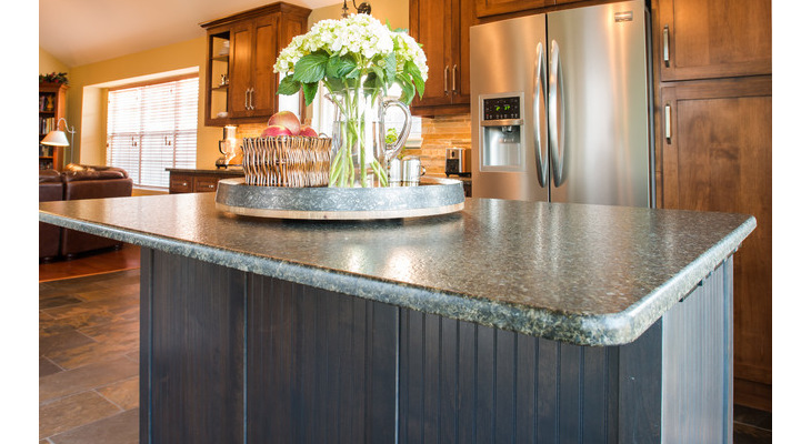
Universal design principles underscored all of the design decisions. The couple’s adult daughter is sight- and hearing-impaired and has a service dog. The kitchen was planned to allow her to prepare food independently. To enhance the visibility for someone with limited sight, Fleck focused on non-glare elements, such as the Uba Tuba dark leather granite used for the countertops and the undercabinet lights that help brighten the space.
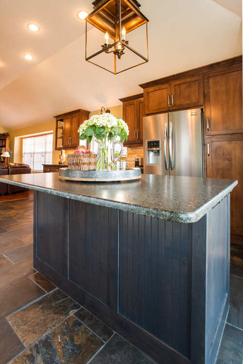
The sink cabinet and island function as focal points that balance the overall space. Beadboard detailing gives them a classic country touch, while feet provide that “furniture feel” often found in farmhouses. A dark gray stain with a hazy glaze on both pieces helps ground the cabinets to the darker gray floor. The same gray stain was used on the entertainment center in the family room to tie the rooms together.
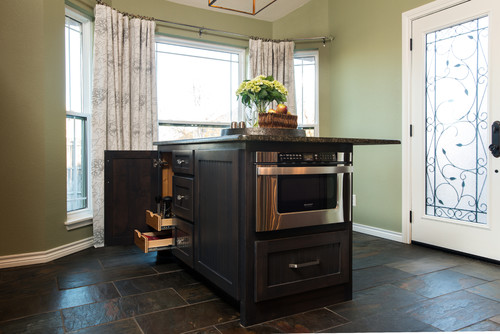
The 72-by-30-inch island occupies what was once an eating nook, providing more space for baking and prep work. The family usually eats in the adjoining dining room, although the countertop’s 15-inch overhang allows plenty of room to pull up chairs for a quick snack or informal meal. A microwave drawer and plenty of pullout storage was incorporated into the island’s design.
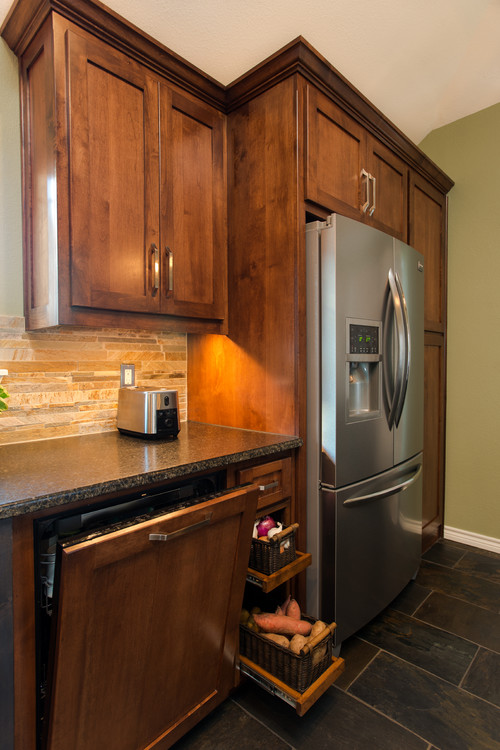
Pullout vegetable doors and glass knobs were two specific requests from the homeowners. Fleck also added a wood panel that matched the cabinets to hide the dishwasher.
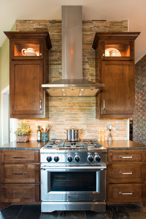
A six-burner, 36-inch range and vent hood sit opposite the sink. Extending the stacked stone backsplash to the ceiling adds height to the overall space.
Open, lantern-style lighting, another homeowner request, illuminates the island. Additional lighting comes from recessed ceiling lights and wall sconces to ensure there’s plenty of light.
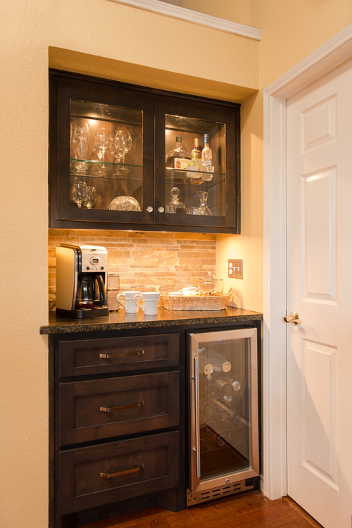
Coffee, soft drinks and other beverages are easily accessible for family and guests in this recessed area that extends into the family room.
Photos by Sonja Quintero
Related Links:
Fantastic web site. A lot of useful information here. I am sending it
to several pals ans additionally sharing in delicious.
And of course, thanks on your effort!