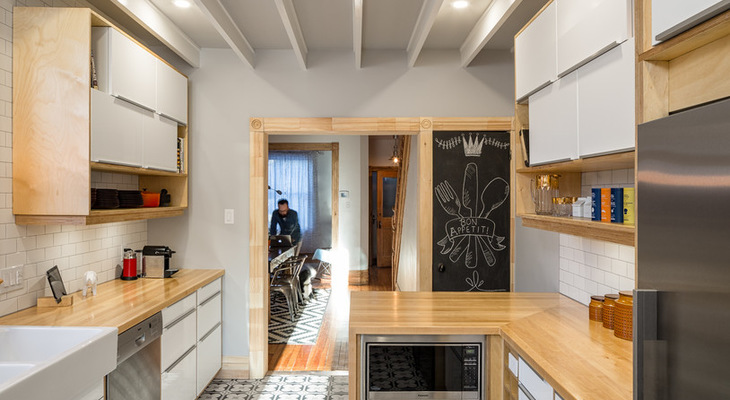
Looking for a kitchen that reflected their funky approach to life and wouldn’t break the bank, an Ottawa couple reached out to interior designer Emma Doucet. The couple gave her, in Doucet’s words, “complete freedom” as she went to work combining stock cabinetry with custom details. While the basic footprint remained the same, the room now has a less cramped layout, increased storage and workspace and a modern vibe that includes patterned floor tile that brings everything in line with the homeowners’ personalities.
Kitchen at a Glance
Who lives here: A couple and their two dogs and cat
Location: Ottawa, Ontario, Canada
Size: 188 square feet (17.5 square meters)
Designer: Emma Doucet of Grassroots Design
BEFORE: The original kitchen felt a bit drab and out of date, with limited counter space. The refrigerator and stove sat awkwardly on either side of the back door. While there was space for a small table, it wasn’t an inviting place to dine.
AFTER: More lighting, warm wood and funky floor tile energizes the new space. A short peninsula adds a bit more storage and countertop space while creating an eating spot for two.
After gutting the kitchen, Doucet began with some minor layout changes, which included moving the refrigerator and stove. Cabinets from Ikea fit around the new refrigerator and continue along the interior wall, ending in the small peninsula. New upper cabinets increase the available storage.
The stove shifted slightly to the right to allow for countertops on both sides. A new double sink and dishwasher were also added.
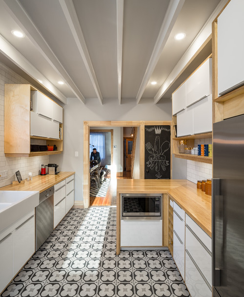
The 10-foot ceiling height allowed Doucet to add two-by-four beams lengthwise for an inexpensive but striking visual accent overhead. She painted the beams Cloud White by Benjamin Moore to give a bit of contrast to the gray-toned Cornforth White paint by Farrow & Ball, a go-to color for Doucet, that she used on the rest of the ceilings and walls.
Chalkboard paint on the door to the basement serves as a handy spot for messages and grocery lists.
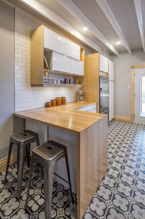
The kitchen floor tiles create a “conversation piece” in the room, Doucet says. The 12-inch-square ceramic tiles were relatively inexpensive at about $12 each but still make a big impact. “They don’t look like everyone else’s,” she says.
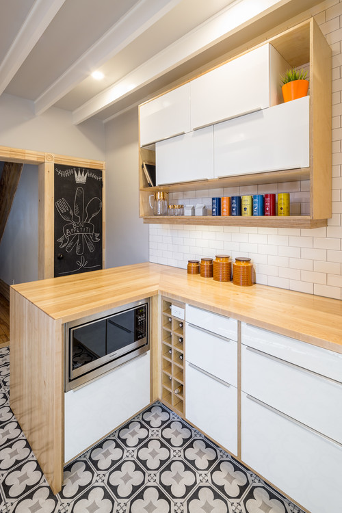
To keep costs in check, Doucet went with Ikea cabinets, then clad them in Baltic birch to conceal the finishes and help tie the look into the new countertops made of local birch. The microwave tucks out of sight but remains easily accessible beneath the peninsula.
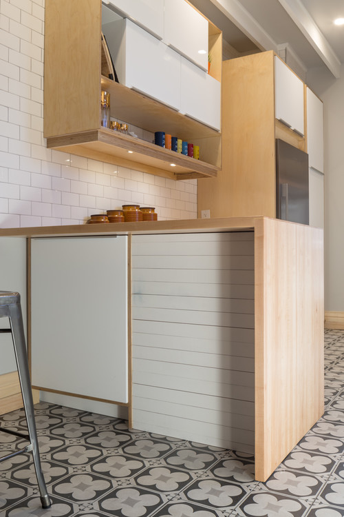
Doucet also added extra storage to the back of the peninsula with a cabinet against the wall. Shiplap on the right side of the peninsula conceals the back of the microwave and the drawer beneath it.
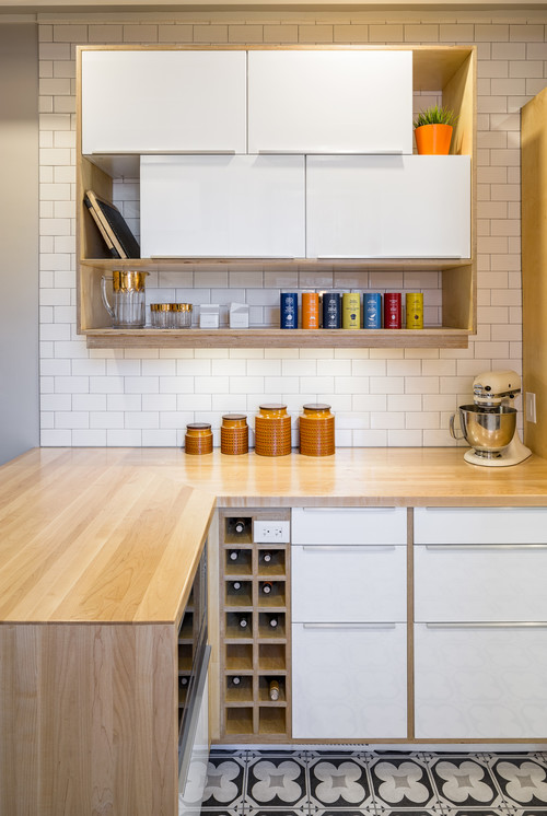
The upper cabinet doors lift up rather than slide, allowing for easy access to the entire interior at once. Doucet chose to have these doors be slightly narrower than the interior space, leaving room on the edges of the cabinets for cookbooks and other items. She also added a shelf below both sets of upper cabinets to provide easily accessible storage and display space for collected favorites.
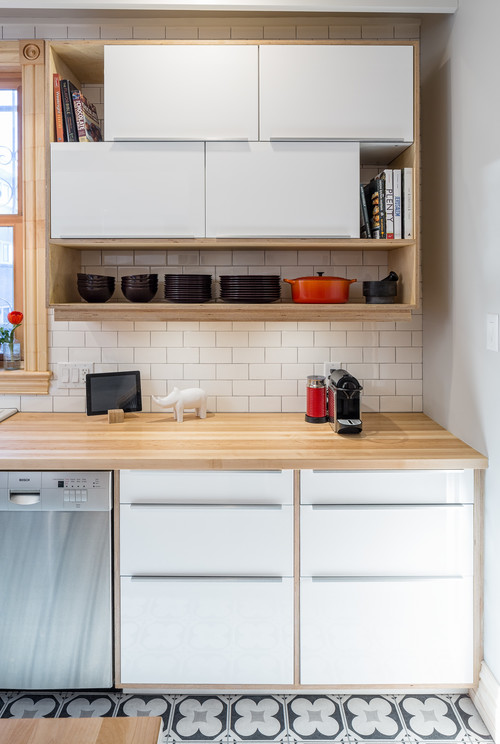
With the exception of the cabinets under the sink, the lower shelving units contain pullout drawers rather than shelves. These provide better access to the contents at the back.
New casing around the window matches that found on the doorway to the hall and dining room and the basement door.
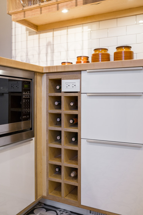
Doucet also filled in the gap between the end of the cabinets along the wall and the peninsula with a custom-built wine rack made of birch that includes a handy built-in outlet.
Related Links:
