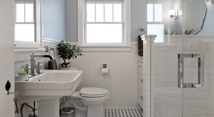
A 1980s renovation had stripped the charm from this circa 1910 Craftsman home’s bathroom, leaving it dark, dated and cramped. Interior designer Christa Pirl brought era-appropriate character back with elements such as black and white tile, beadboard wainscoting, a redesigned window and a pedestal sink. At the same time, she kept the room updated with clean lines, glass accent tile and modern lighting, and she laid the room out so that her clients can stay in the home as they get older.
Room at a Glance
Who lives here: A couple of empty nesters
Location: Salt Lake City, Utah
Size: About 50 square feet (4.6 square meters)
Designer: Christa Pirl of Christa Pirl Interiors
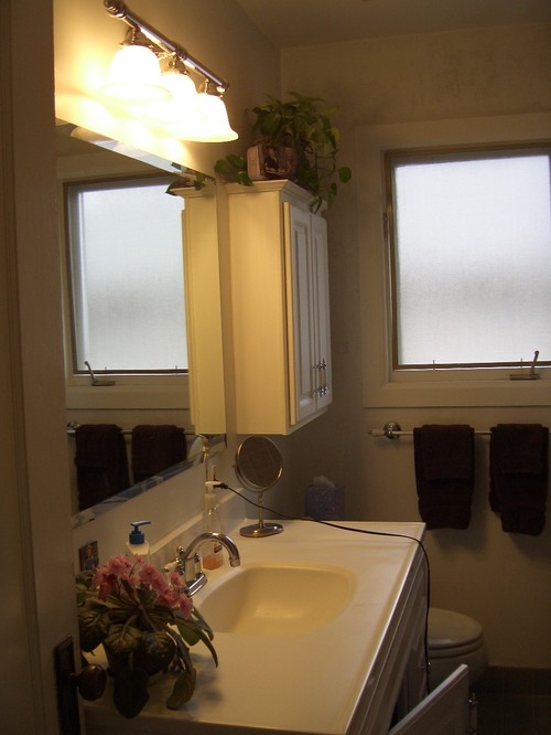
BEFORE: The ’80s called Pirl and they wanted their bathroom back. When she arrived at the scene, she was greeted by outdated violet tile, low-quality cabinets and a dark and cramped space.
Her clients had a few immediate and future uses in mind for the first-floor bathroom project. Because it was adjacent to two guest rooms, it would immediately serve as a guest bath, but should they need to move their master bedroom downstairs in the future, it would serve as the master bath. Also, it is the only bathroom on the main level, so they wanted it to serve as a pretty powder room when they entertain.
BEFORE: The wall at the end of the shower stall chopped up and darkened the small room.
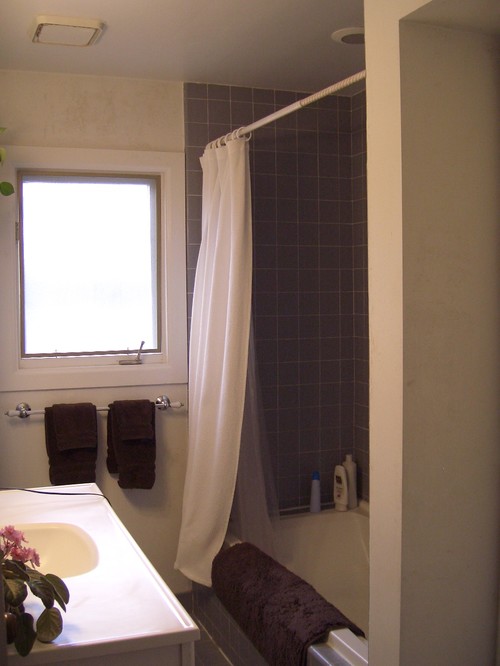
Two main factors drove the design. One, making sure her clients could age in place — they wanted a shower that would be easy to use should they have any mobility problems in the future. Two, they wanted a space that was light and bright. “The best way to accomplish this was to remove the bulky tub and divider wall and add a larger glass shower stall,” Pirl says. Her clients had no interest in adding a tub since they already had one in another part of the house. Pirl notes that many of her clients are less interested in bathtubs lately and instead focus on luxurious spa-like showers.
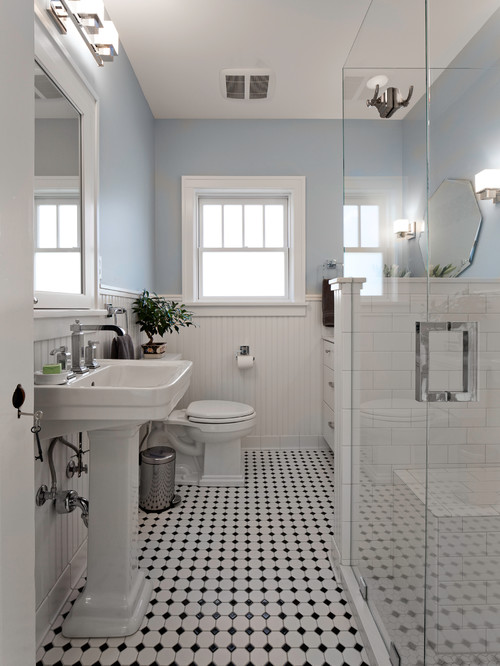
“The window was existing, but it was very basic with no mullions. It felt very bland and dated,” Pirl says. She kept the window size the same but replaced it with a window that has Craftsman-era mullions.
Because there is a lot of beautiful millwork throughout the rest of the home, the designer knew wood wainscoting was the way to go. She placed beadboard at a height that created a high backsplash. “The relationship between the window and the wainscoting was very important, and luckily the height of the window worked perfectly with the wainscot,” she says.
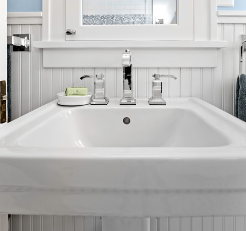
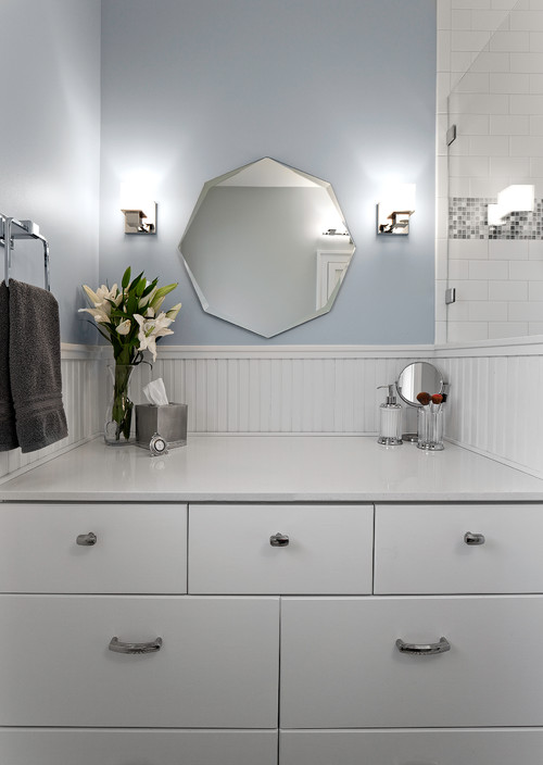
Pirl layered in a mix of elements from the first few decades of the 20th century. “The pedestal sink, black and white floor tile and white subway tile are classic early 20th century; the wood elements like the wainscot, window mullions and custom built-in medicine cabinet fit in really well with the Craftsman style of the house; and the vanity mirror and chrome cabinet hardware reference the 1920s and Art Deco style,” she says.
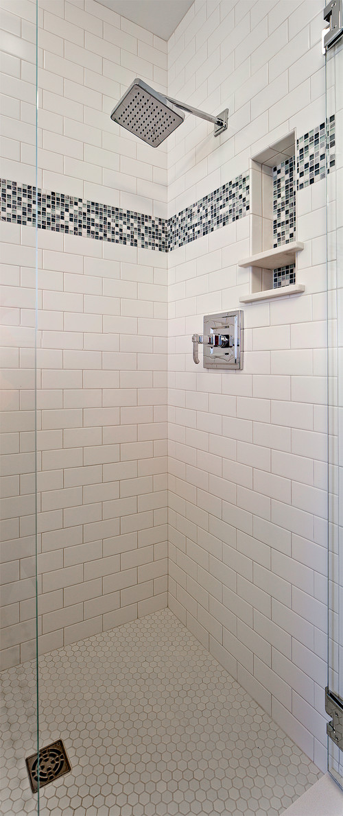
The shower surround is classic white subway tile, but with a modern touch: a glass mosaic accent band. “We wanted just a touch of color and texture, which we brought in with the accent band in the shower,” the designer says. She and her clients chose a mix of white, blue and black tiles to coordinate with the black and white tile floor and the gray-blue wall paint.
Glass above the wainscoting on the right shares light between the shower stall and the rest of the bathroom and keeps the views open.
Because she opted for a pedestal sink rather than a vanity with cabinets, Pirl knew she’d need to give her clients more storage elsewhere. Also, her client wanted a separate station for hair and makeup. Rather than building a tall cabinet for storage, the designer cleverly created a high countertop with a dresser-like cabinet chock full of storage. She added great makeup lighting and an octagonal mirror. This area has the Art Deco-style elements she mentioned. Mixing eras makes it seem as though the bathroom has evolved over the decades.
Featured Products:
Carnegie Widespread Bath Faucet in Polished Chrome
Carnegie 1-Handle Shower in Polished Chrome
Carnegie Towel Ring in Polished Chrome
Carnegie 24″ Towel Bar in Polished Chrome
Related Links:
Roots of Style: See What Defines a Craftsman Home
Remodel Your Bathroom
The Brighter, the Better